
A lot of folks have strong opinions on the 2022 Super Bowl Logo. Some people think the numerals look blood-stained, and others claim that they can see the face of the devil in the “V”! (We don’t see it!)
But if you think the current logo is bad, check out these doozies from Super Bowls past!

Super Bowl I – We can’t give them too much flak, the inventors of the Super Bowl had no idea that we’d be celebrating the ultimate football competition nearly 100 years later!
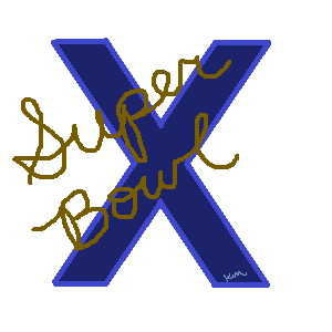
Super Bowl X – This one was just blah. Even the folks in the 1970’s thought it was underwhelming. Kids nowadays can’t even read that weird fancy connected script. This is one logo that doesn’t stand the test of time!

Super Bowl XXXI – Up until this time, the most phoned-in of the Super Bowl logos. Nothing screams “1997” and then kicks you in the dick like Comic Sans. Try harder next year!

Super Bowl XXXII – They clearly didn’t try harder the next year. They just gave it a background color and added a Roman letter-number. It’s not even the same font! Amateur hour over here.

Super Bowl XXII – The all-time worstest Super Bowl Logo! The art department hit it out of the park kicked it through the uprights with the cute football graphic. But then spellcheck didn’t catch the word “bowel” in the name. This particular Super Bowl had the least amount of merch sales of any Super Bowl.
So when you tune in to the Biggest Big Game of the year and you find yourself staring into the hellfire Roman numberals, just think–it could have been worse.

[…] when everyone hated the Super Bowl LVI logo? But then we took a trip down memory lane and looked at some other truly not-super logos, and the new one didn’t seem so bad after […]